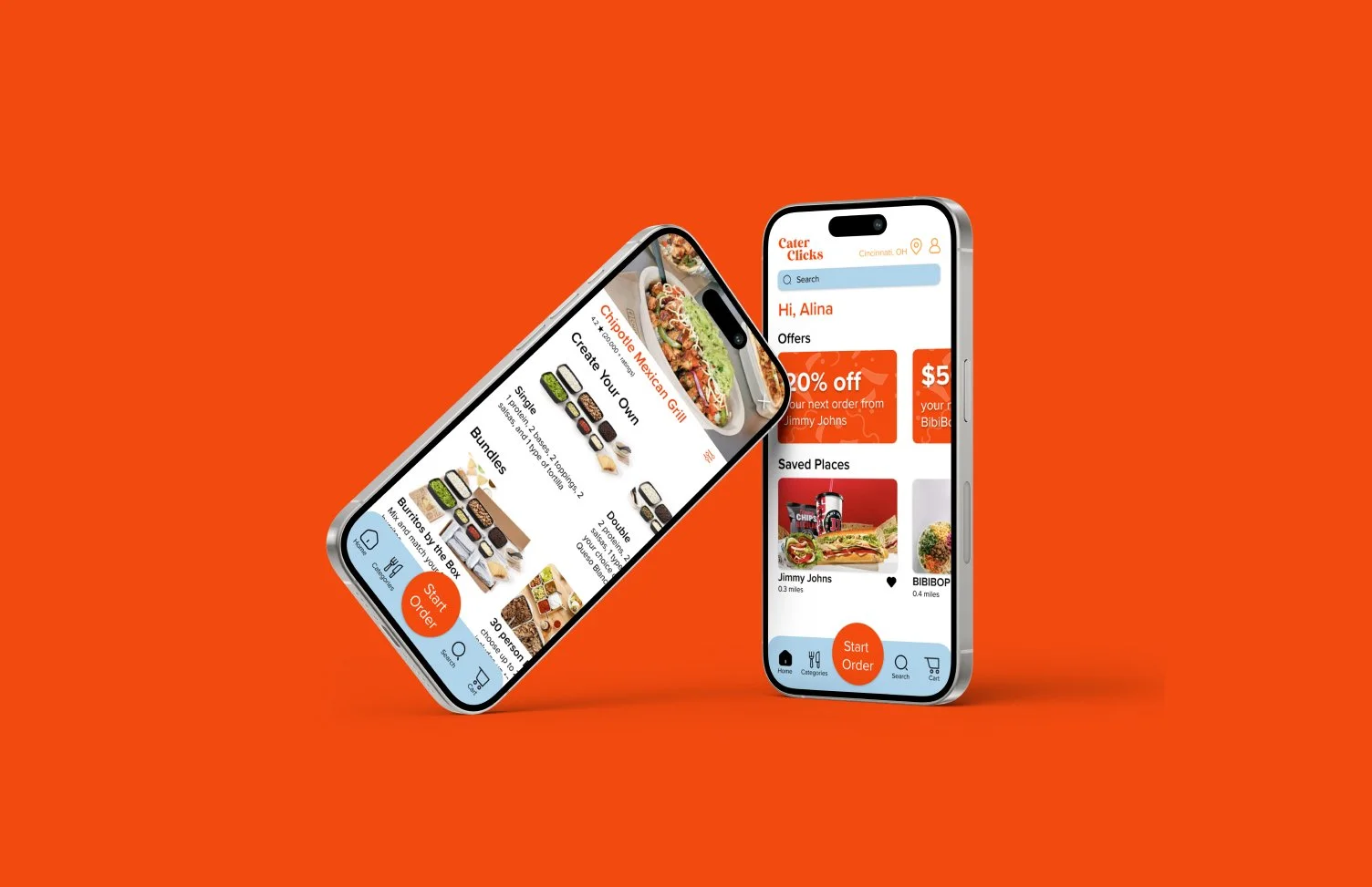
Cater Clicks
Collaboration Studio | 2024 Fall Semester
Our project goals focus on creating inclusive, functional, and engaging transit environments that prioritize community identity and user experience.
User Research
User Interface
Interaction Design
User Journey
01
02
03
User Goals
Enhanced User Experience
I wanted to have a less overwhelming experience to order catering, but have multiple options in one place.
Multiple Outcomes
I wanted to be able to complete a task in multiple ways, but have the same end result.
Design Interface
I wanted to design a bright and colorful interface, but don’t want the color to take away from the structure.

Proposed Concept
I built this experience because it was extremely frustrating for me to find catering that was well within my budget. I searched for hours on many different websites for each company to find catering that would be able to feed 30 people, but also be in my budget. I knew there had to be a simpler way.
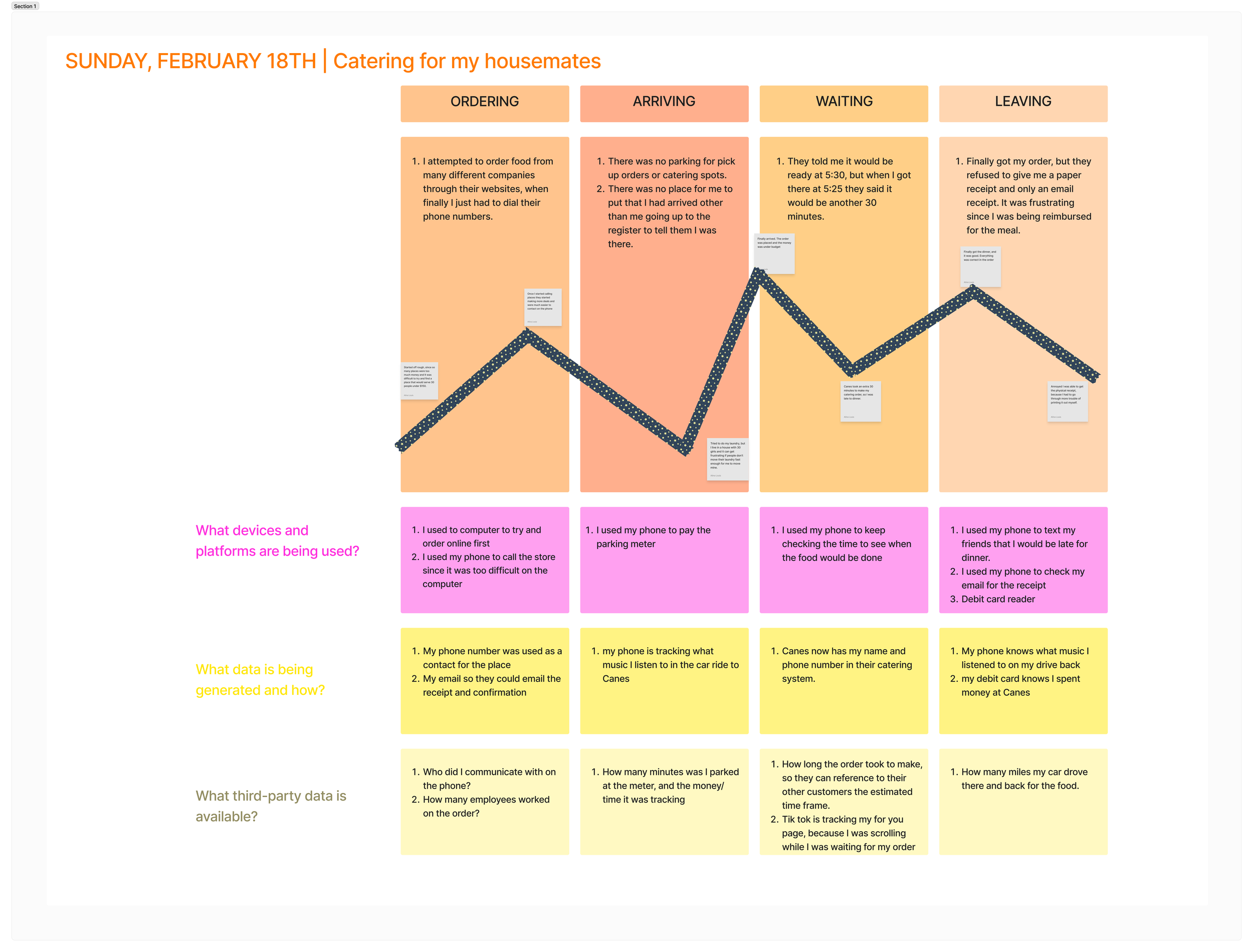
User Journey
Tate is ordering food for her graduation party. There are 25 of them, but Tate is providing all the food, while others bring desserts. She needs enough food to feed everyone and hopefully have extra. Her budget is $450, but it seems like every place she is trying to order from is way over her budget, or not enough food. She would like a platform where she can filter the places where she can cater for under her budget but still have plenty of food for her guests.
Name: Tate Johnson
Age: 22

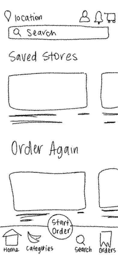
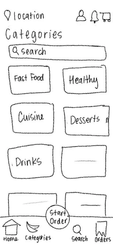
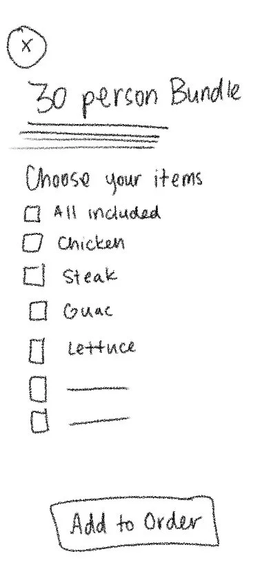
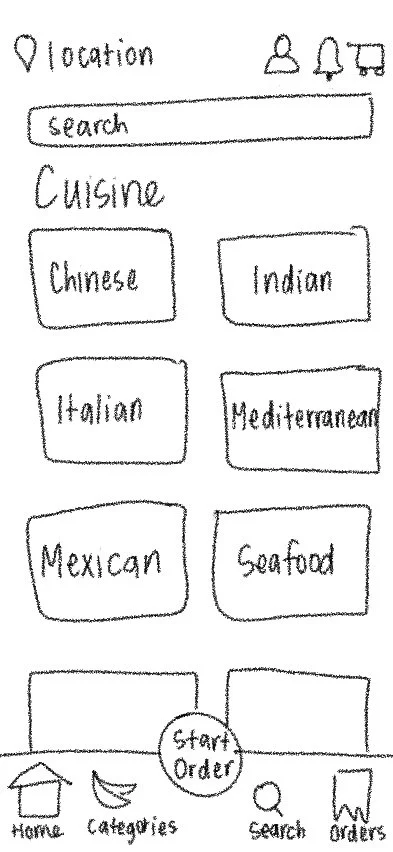
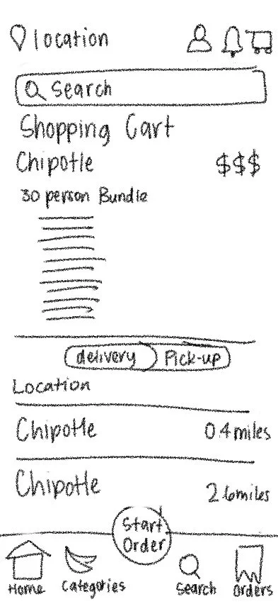
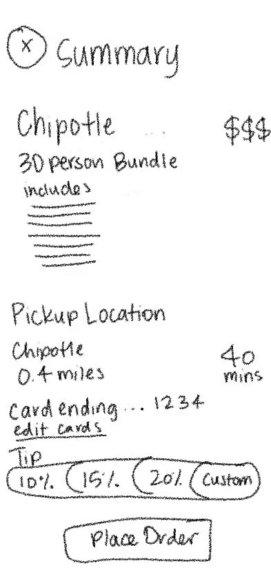
Paper Wireframes
Feedback:
What was working?
Flow was consistent and easy to follow along.
General layout is clean and organized
What wasn’t working?
Categories & cuisine page could be combined.
Instead of orders, have only the shopping cart on the bottom navigation bar.
Icon for categories gives off the wrong intention.


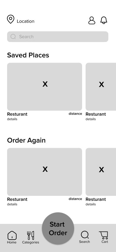
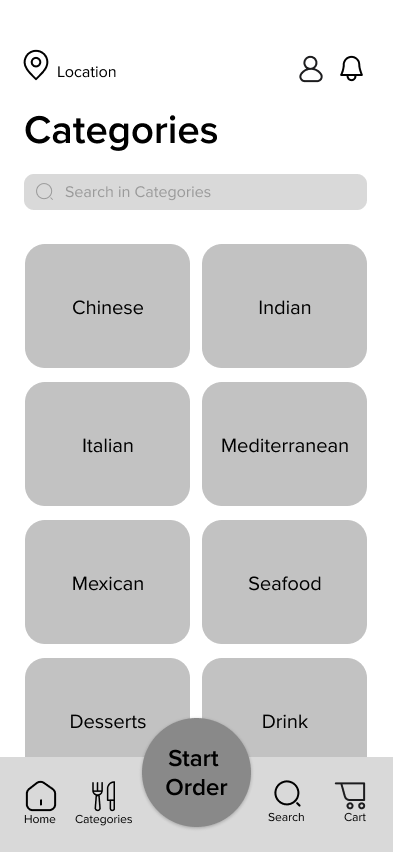
Digital Wireframes
Feedback:
What was working?
Effective grid.
Iconography is cohesive.
Hierarchy between the text and images.
Large “Start Order” button.
What wasn’t working?
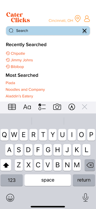
Consistency of the search bar across screens.
Where will the logo go?
Smallest text size is too small for the users eye.
Space in between the images.


Style Frames
What was working?
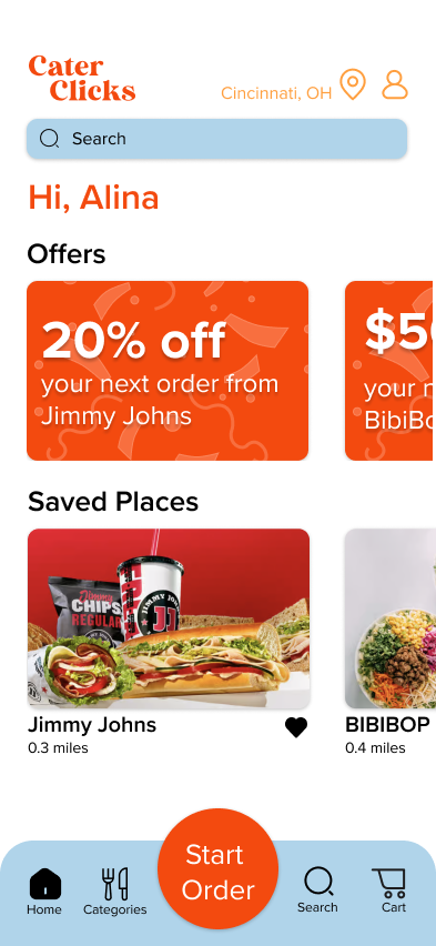
Large “Start Order” button is enticing.
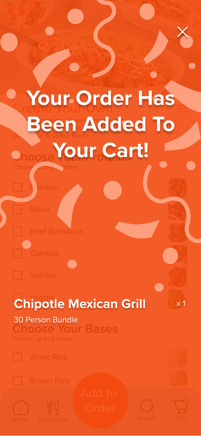
Bringing a small part of the brand into the confirmation pages.
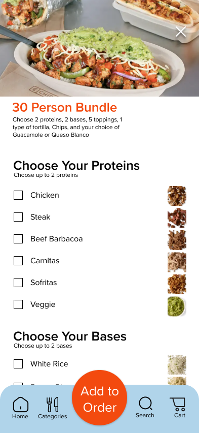
Consistency between the screens, but are distinguishable.
Color application is consistent and has good hierarchy.
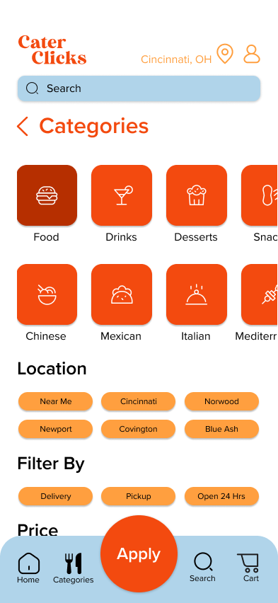

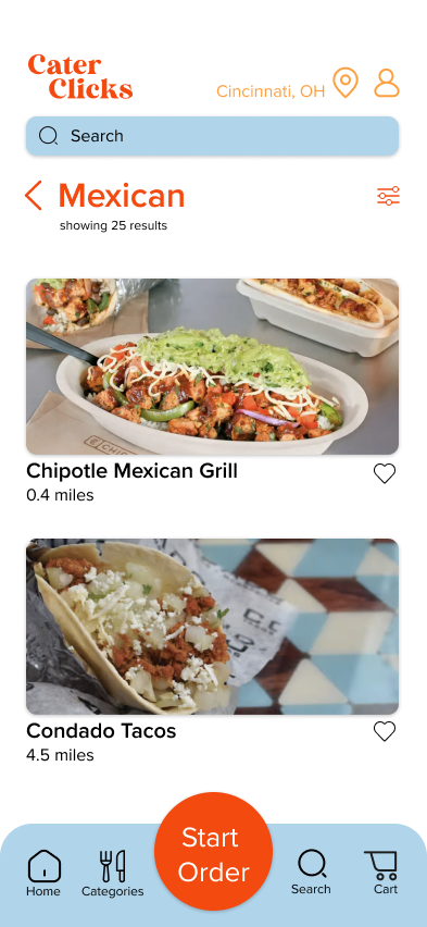

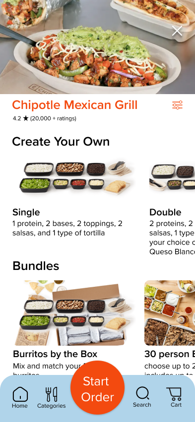

Color & Illustration


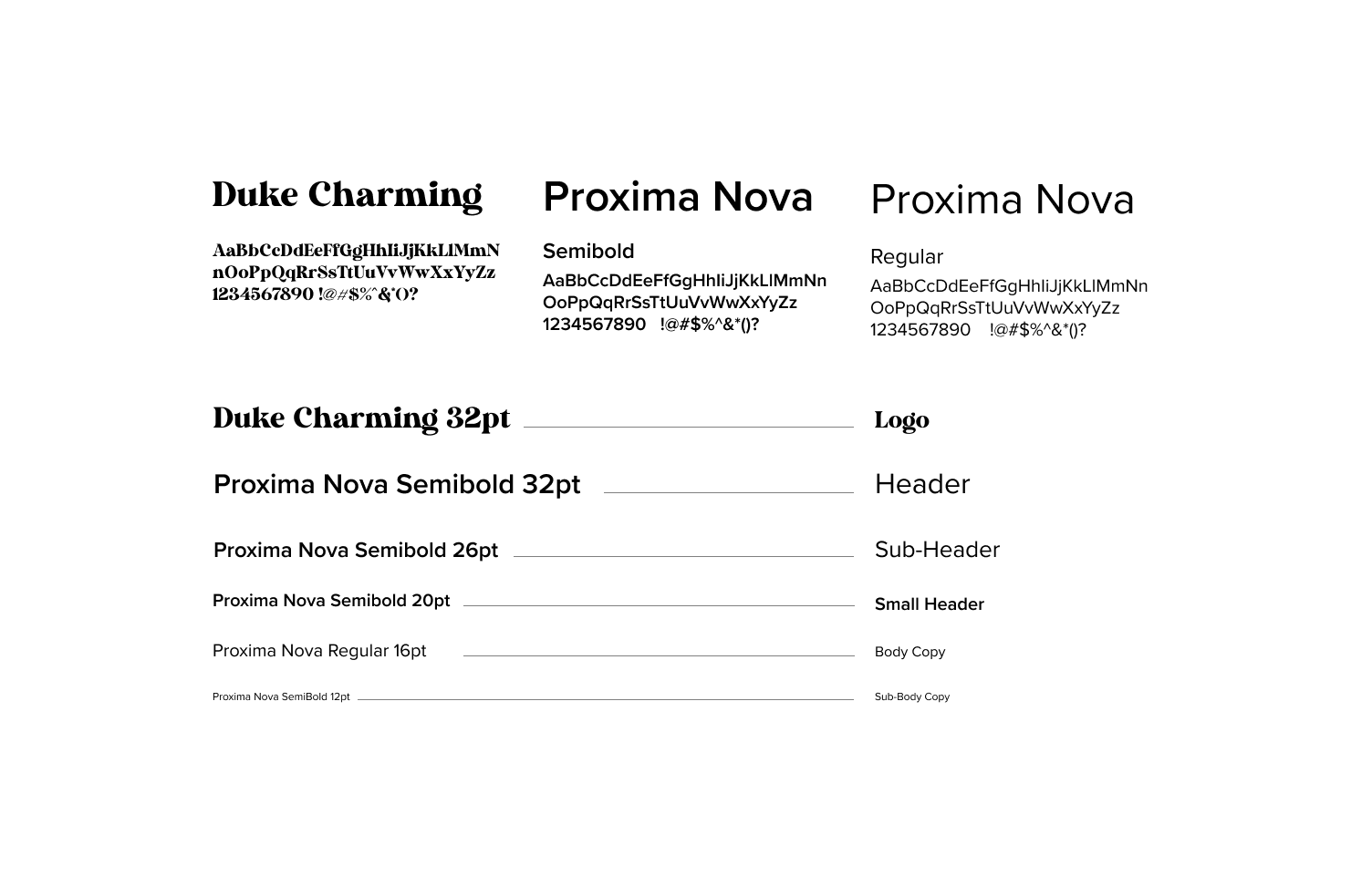
Type
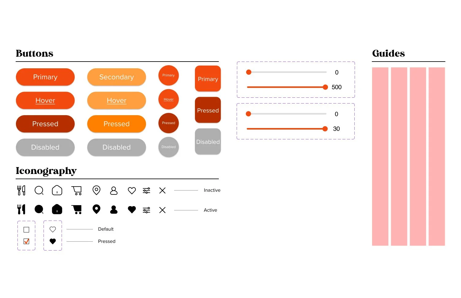
Component Library
