Optico
Typography | 2022 Fall Semester
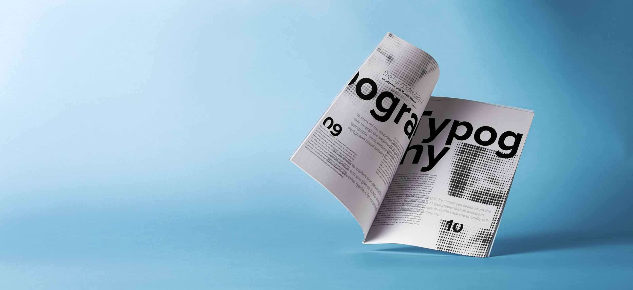
Optico is a science and technology publication that focuses on the science of legibility and readability in typography.
Typography
Adobe Photoshop
Adobe InDesign
Adobe Illustrator
Design Goals
Readability
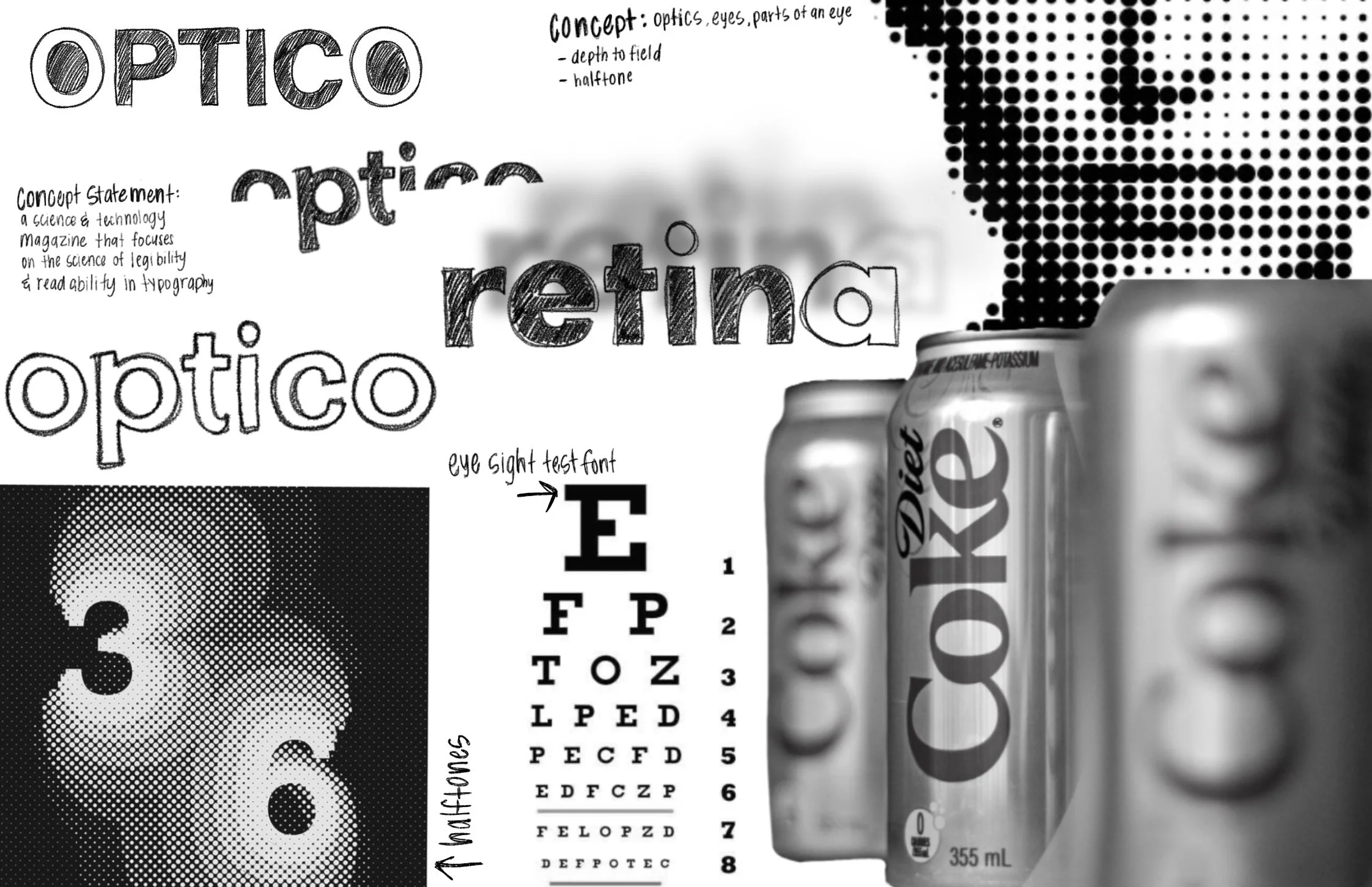
I wanted to make sure that the publication used fonts that were scientifically proven to improve readability.
Legibility
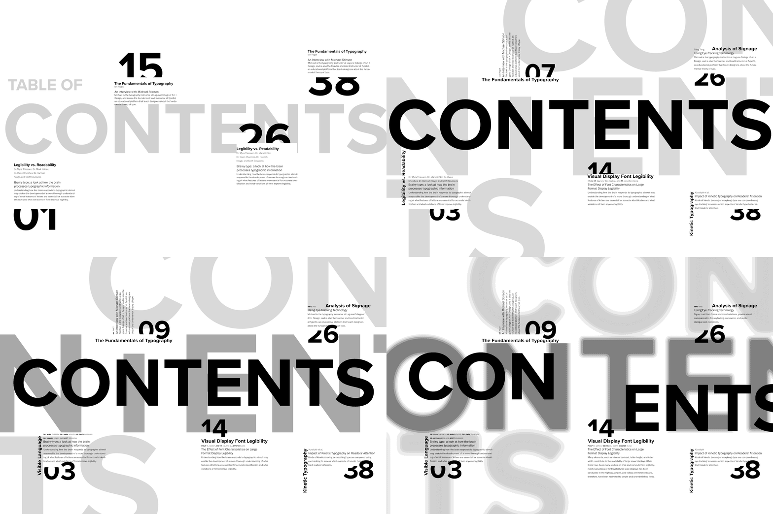
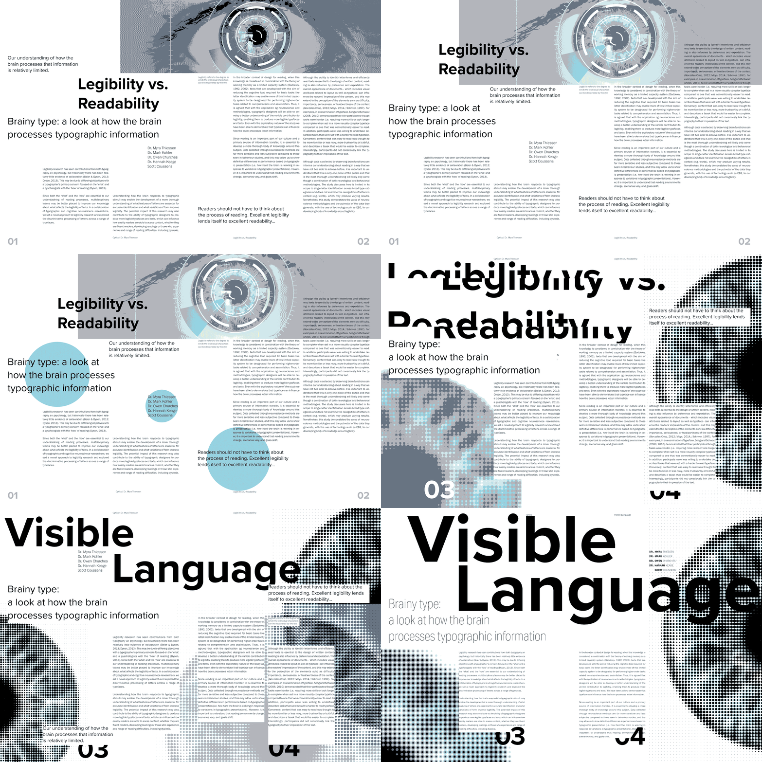
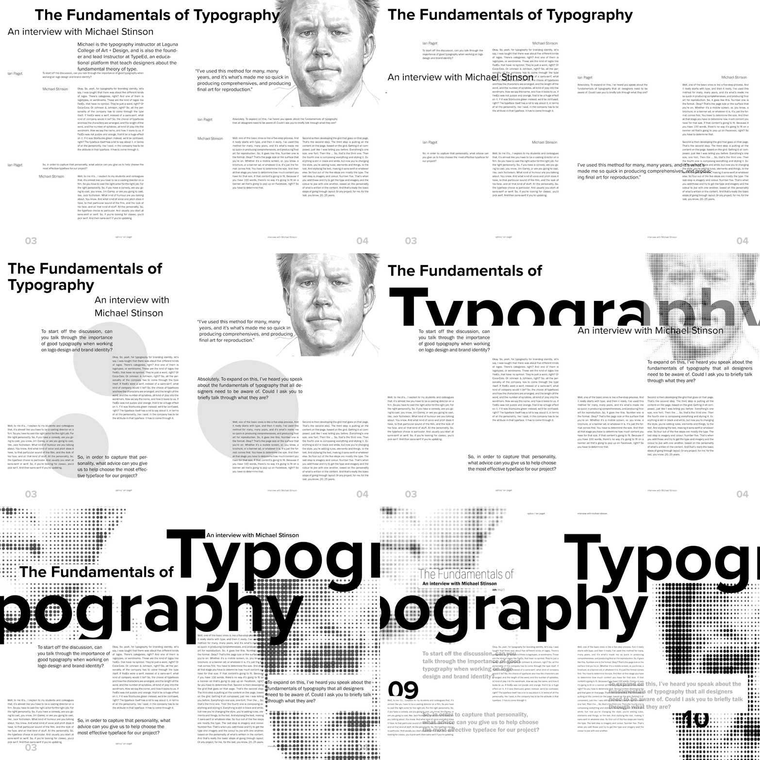
I wanted to incorporate images of depth, in a non-traditional way. I used halftone to alter the images into a creative way but making them still legible.
Creating A Typographic Wordmark
Exploration of many different sans-serif typefaces to effectively portray the concept statement, and the design and typographic attributes.
Exploration




Iterations
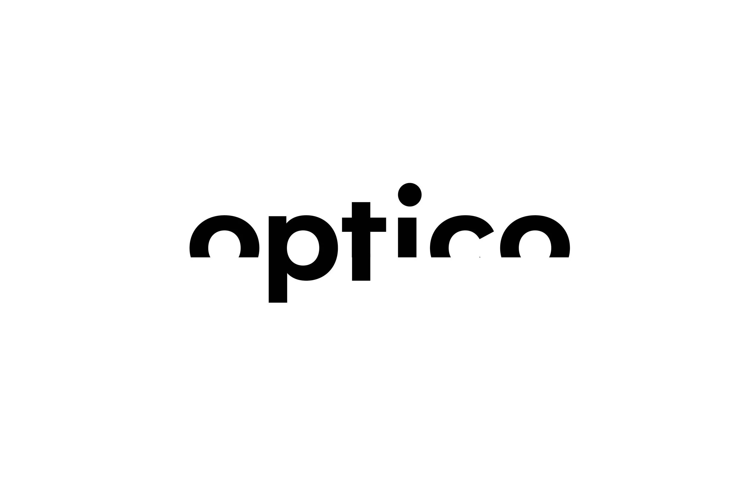
After focusing on my typeface I made minor changes to fit my own design attributes.

Final Wordmark
The font I chose was Semi-Bold Monsterrat. I felt it portrayed a strong and symmetrical structure.
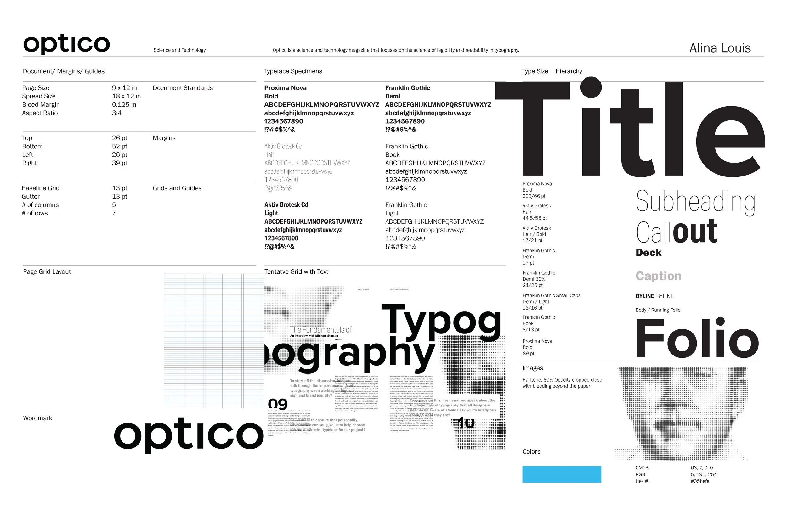
Creating guides to follow when constructing the final publication spreads.
Creating a Visual Image
Developing A Composition
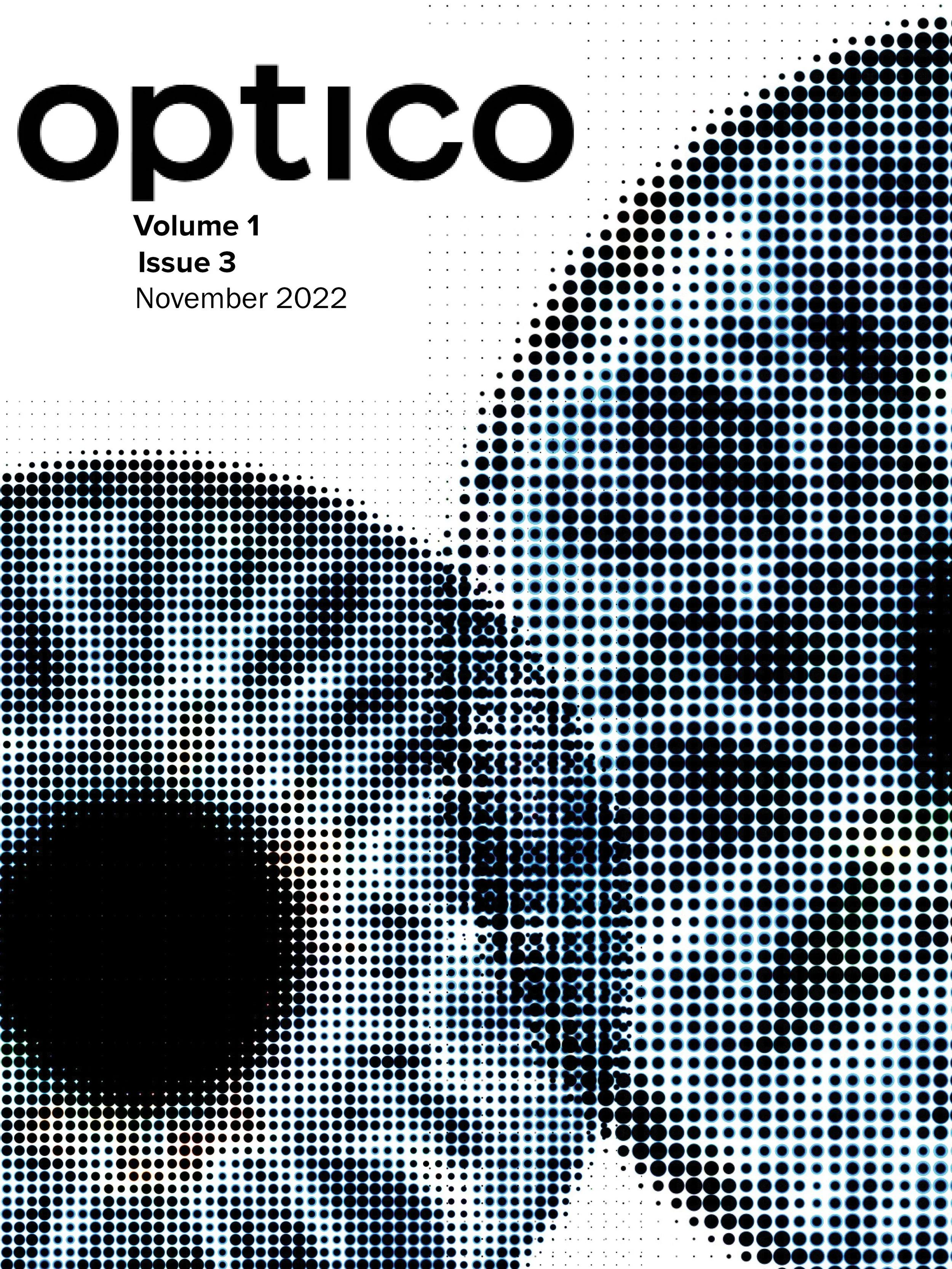

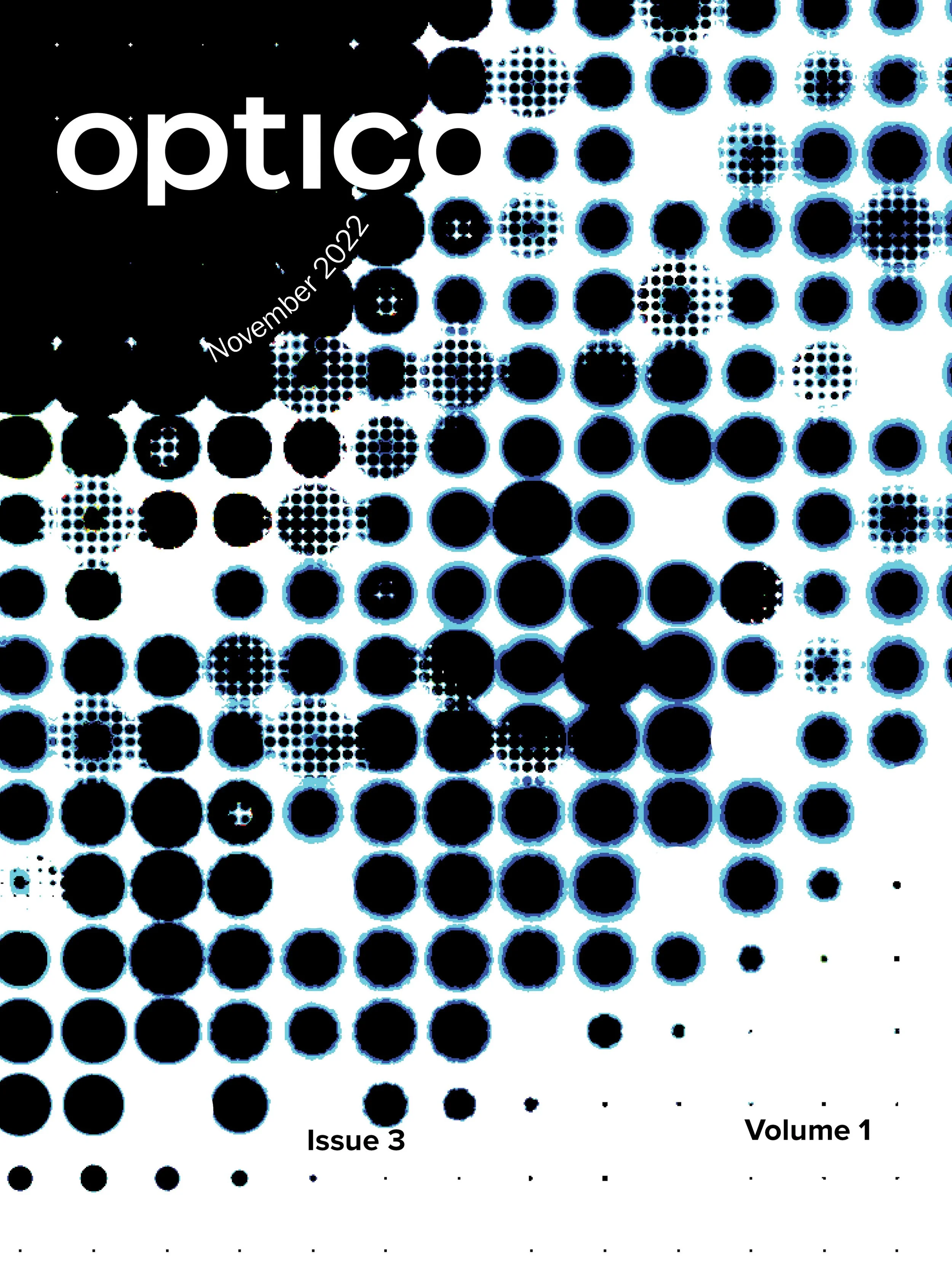
After developing initial spread sketches, tasked with developing a cover page that also flowed with the concept.
