Transit Placemaking
Collaboration Studio | 2024 Fall Semester
Our project goals focus on creating inclusive, functional, and engaging transit environments that prioritize community identity and user experience.
User Research
Industrial Design
Typography
Fabrication
Design Goals
Enhanced User Experience
01
We wanted to prioritize accessibility, comfort, and safety to make transit spaces user-friendly for diverse groups, including commuters, tourists, and students.
Foster Community Identity
02
We wanted to incorporate local culture, history, and the aesthetics of Metro to create a sense of place and connection.
Sustainability
03
Design environmentally responsible spaces that promote green practices, such as using sustainable materials and encouraging public transit use.



Secondary Research
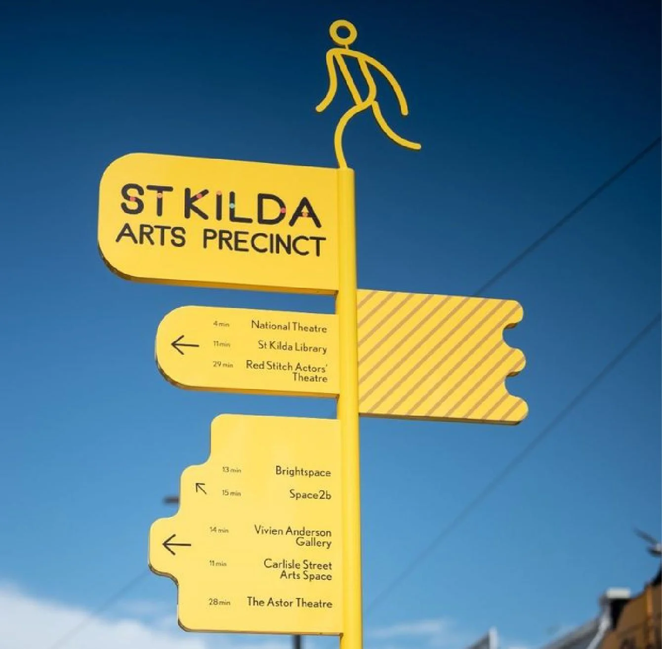
Throughout our secondary research, we explored unique themes of perception and space. We looked at case studies, successful city plans, and articles on public space and transit design. We also explored who uses transit and how they function with it, which helped shape ideas that felt grounded and practical.
Research
Synthesis
Analysis
Primary Research
Observations
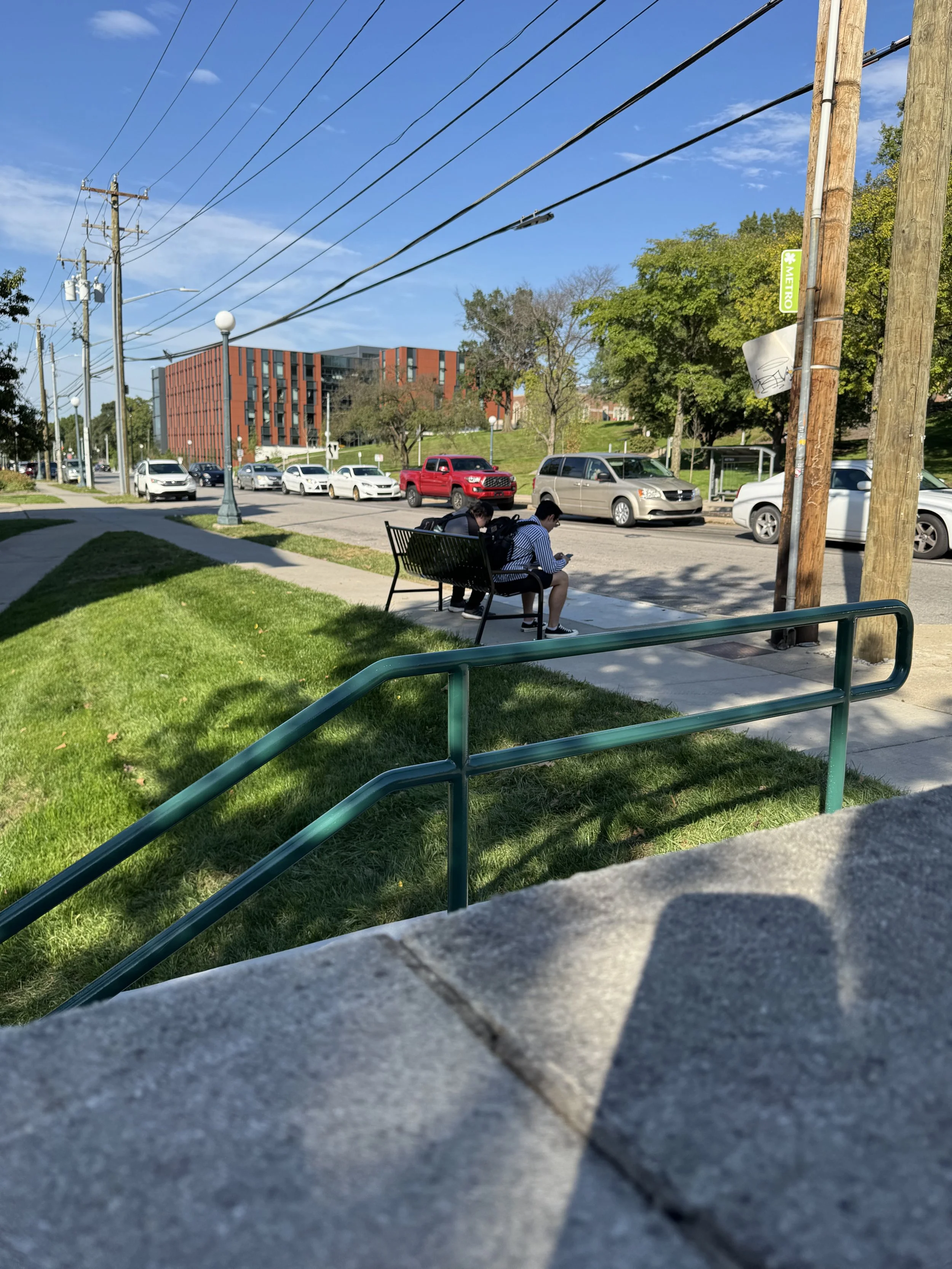
Observed user behaviors and interactions with real-world contexts, discovering the needs and challenges that may not always be apparent to us.
Key Insights

Survey Results
Posted these stickers around bus stops in Cincinnati. Questions were centered around our research goals. In total, we only received 6 responses.
Flexible Seating Options
Interviews
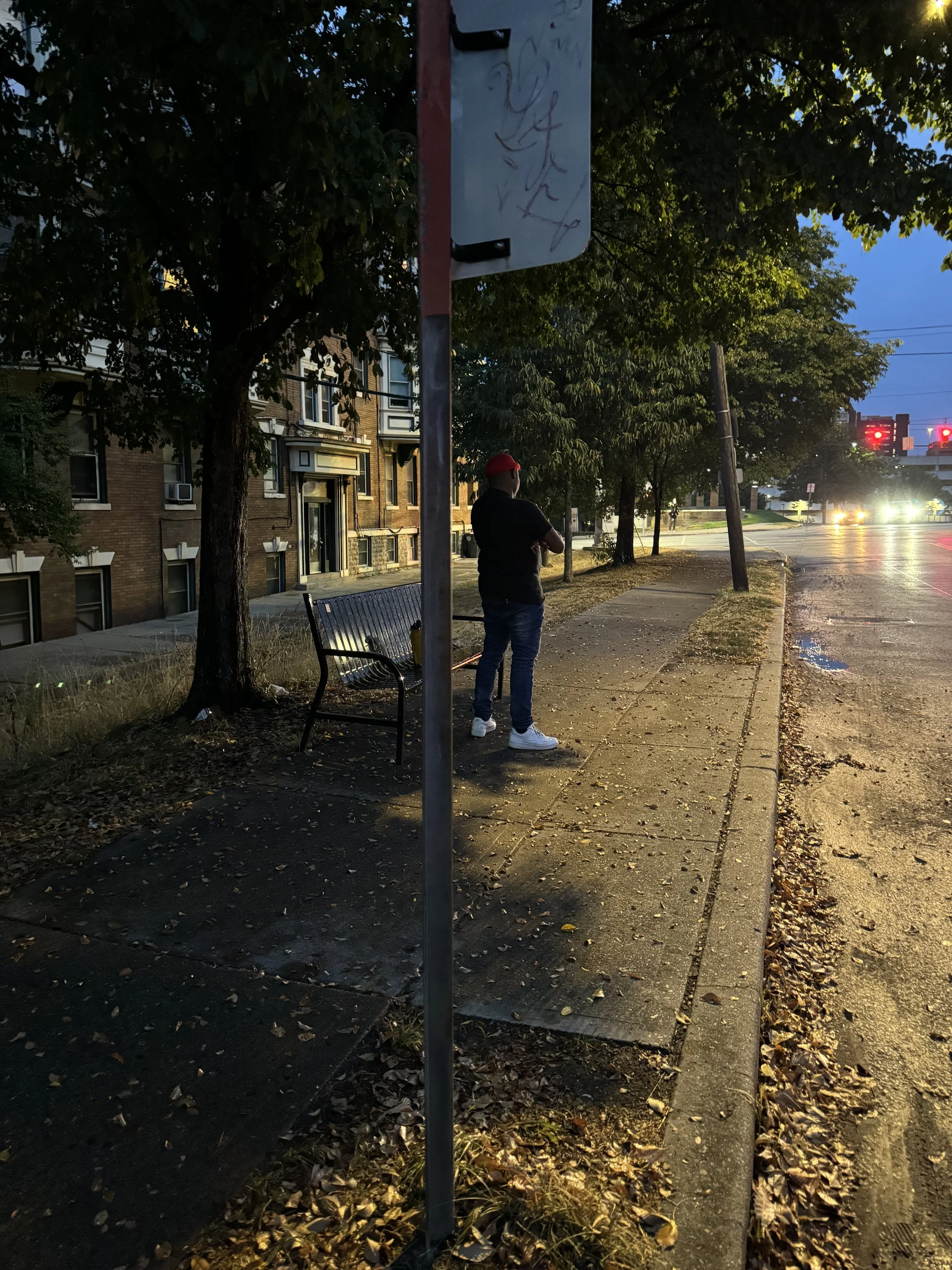
Conducted in-person interviews with bus users. Questions were centered around the overall experience of the bus system.
Personal Technology
Individualistic Experience
Space for Personal Belongings
Experience Influenced by Weather
Sketches
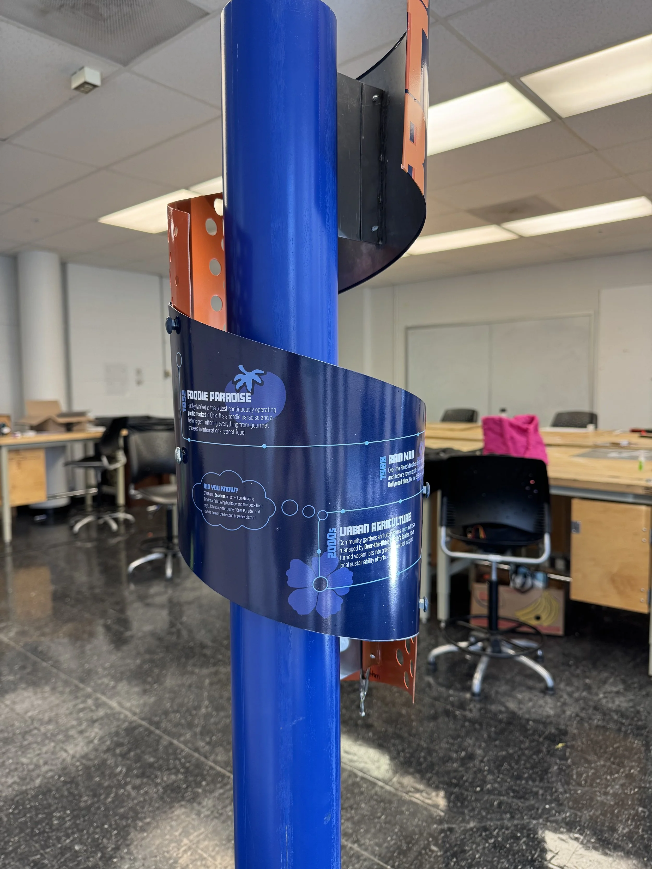
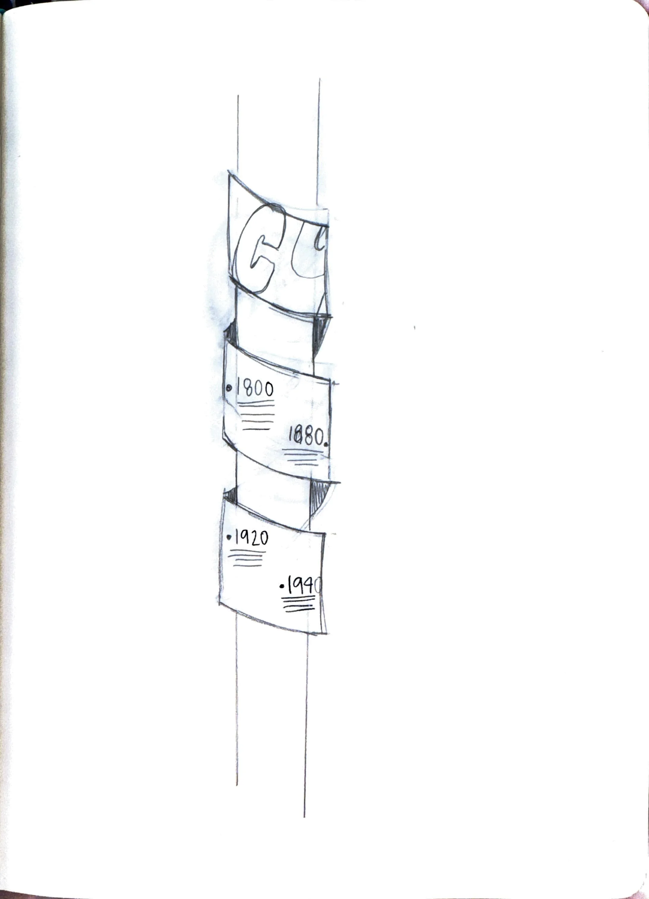
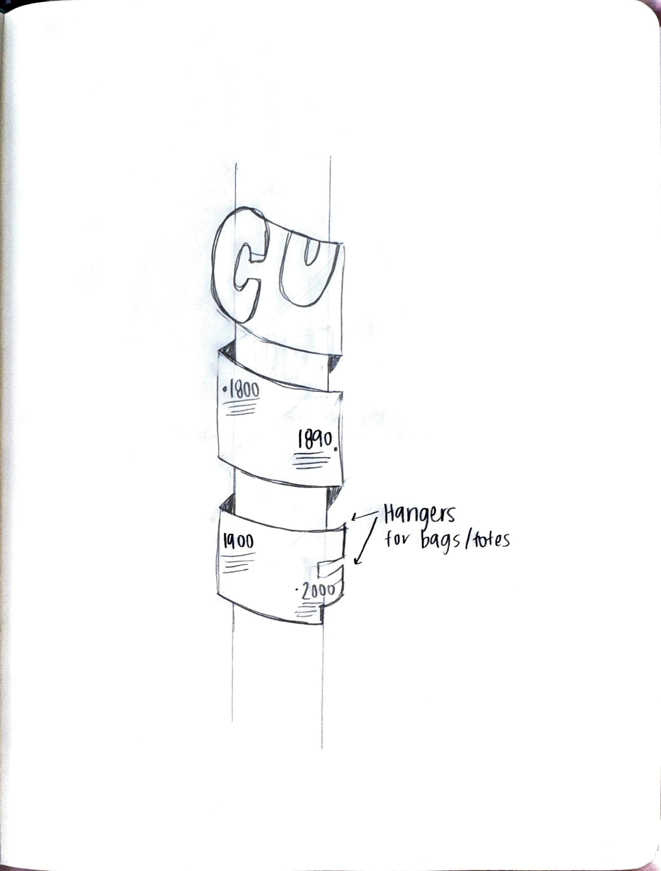
My concept is a historical timeline graphic that visually narrates the evolution of the neighborhood's identity, through a helix shape. It highlights key events and milestones to celebrate its rich history and foster community pride.



Design Elements
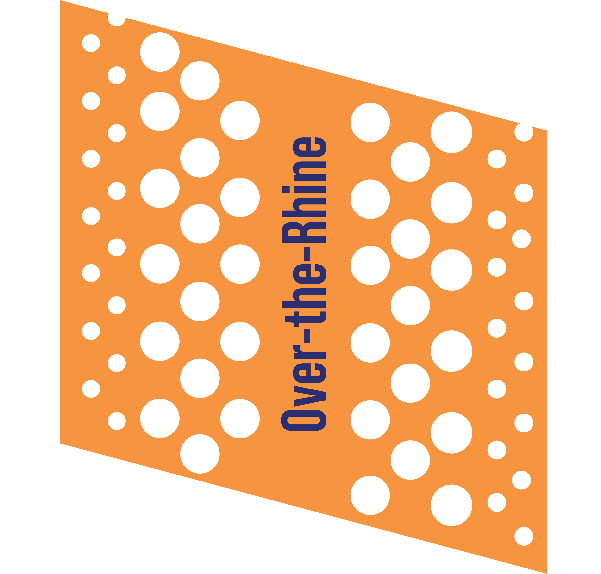
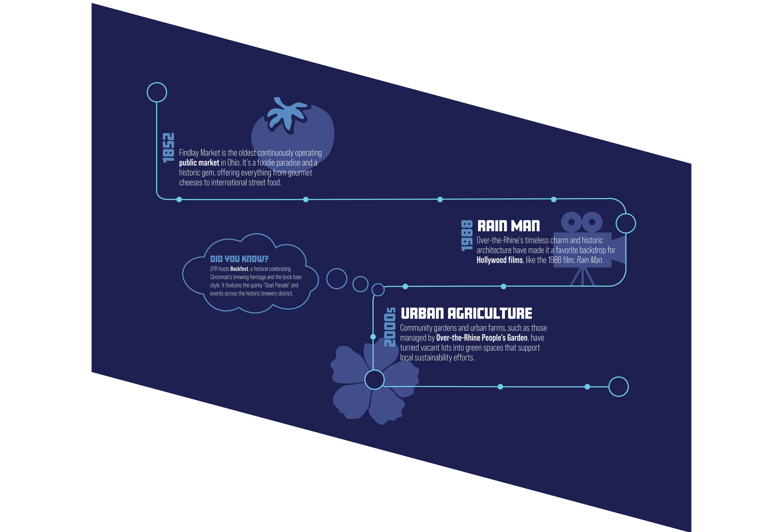
I dove into researching unique and intriguing facts to make the subject more engaging and relatable for others. I chose these colors based off the history of bus stops and how they had a large orange indicator.
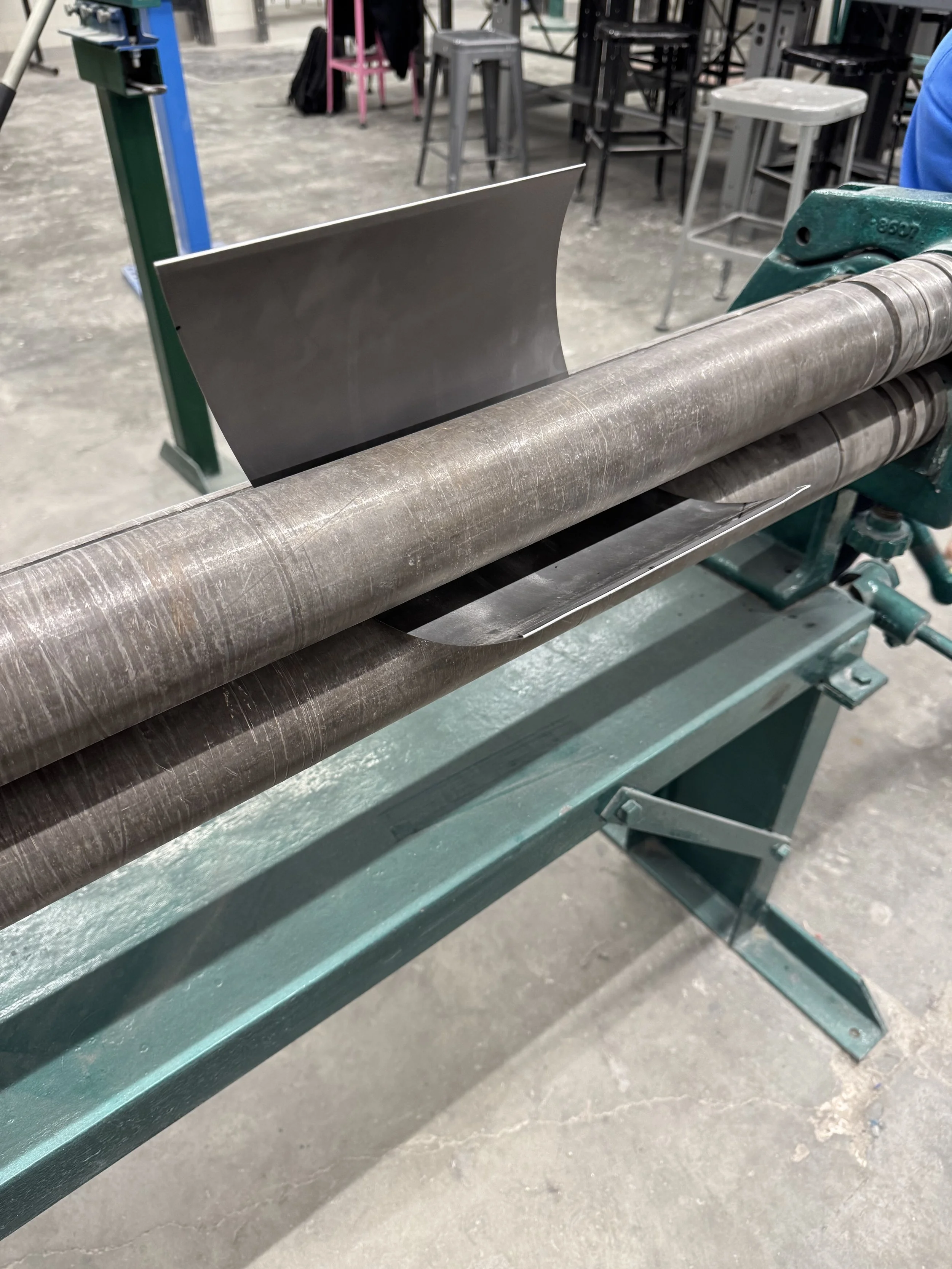
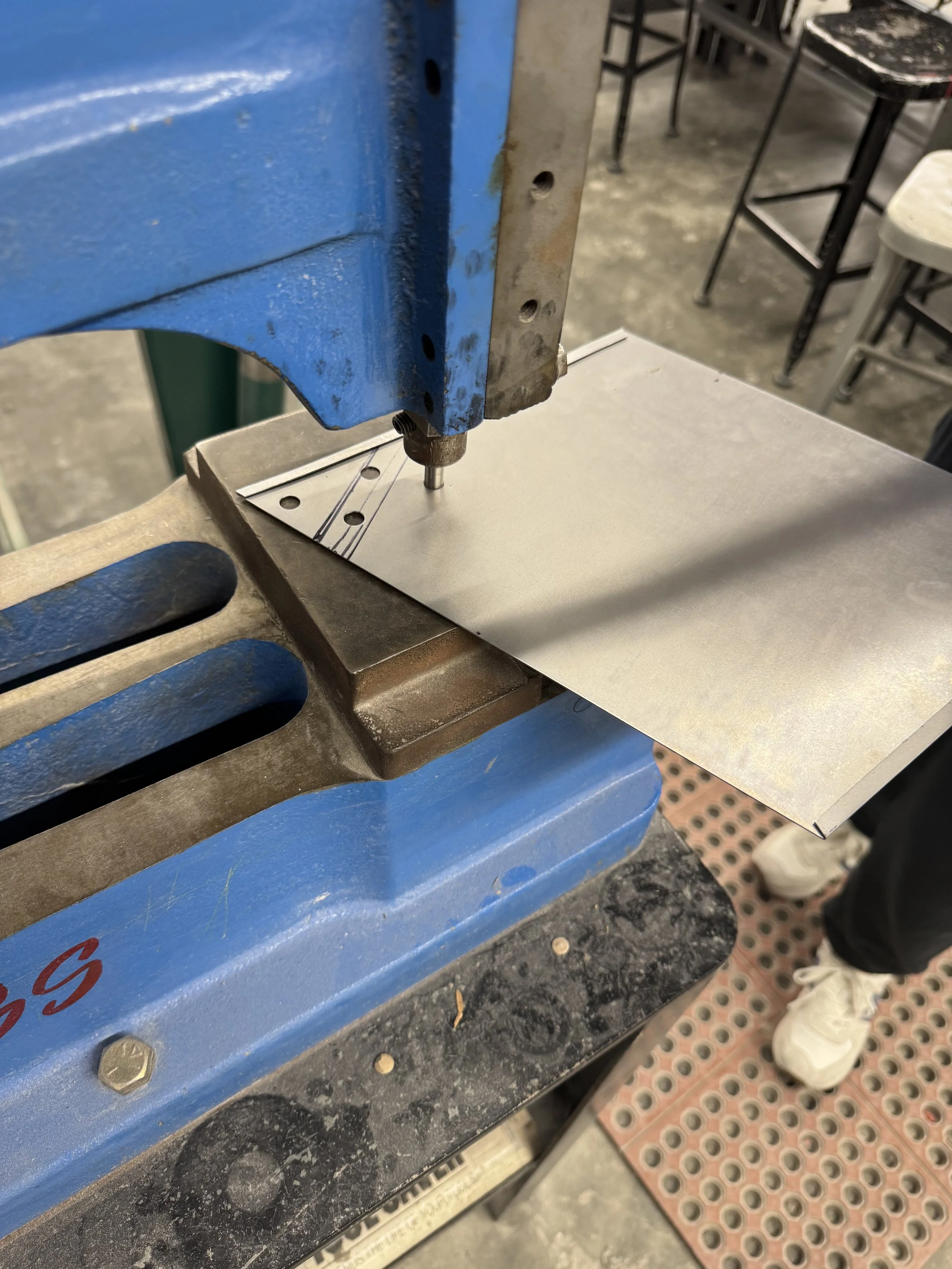
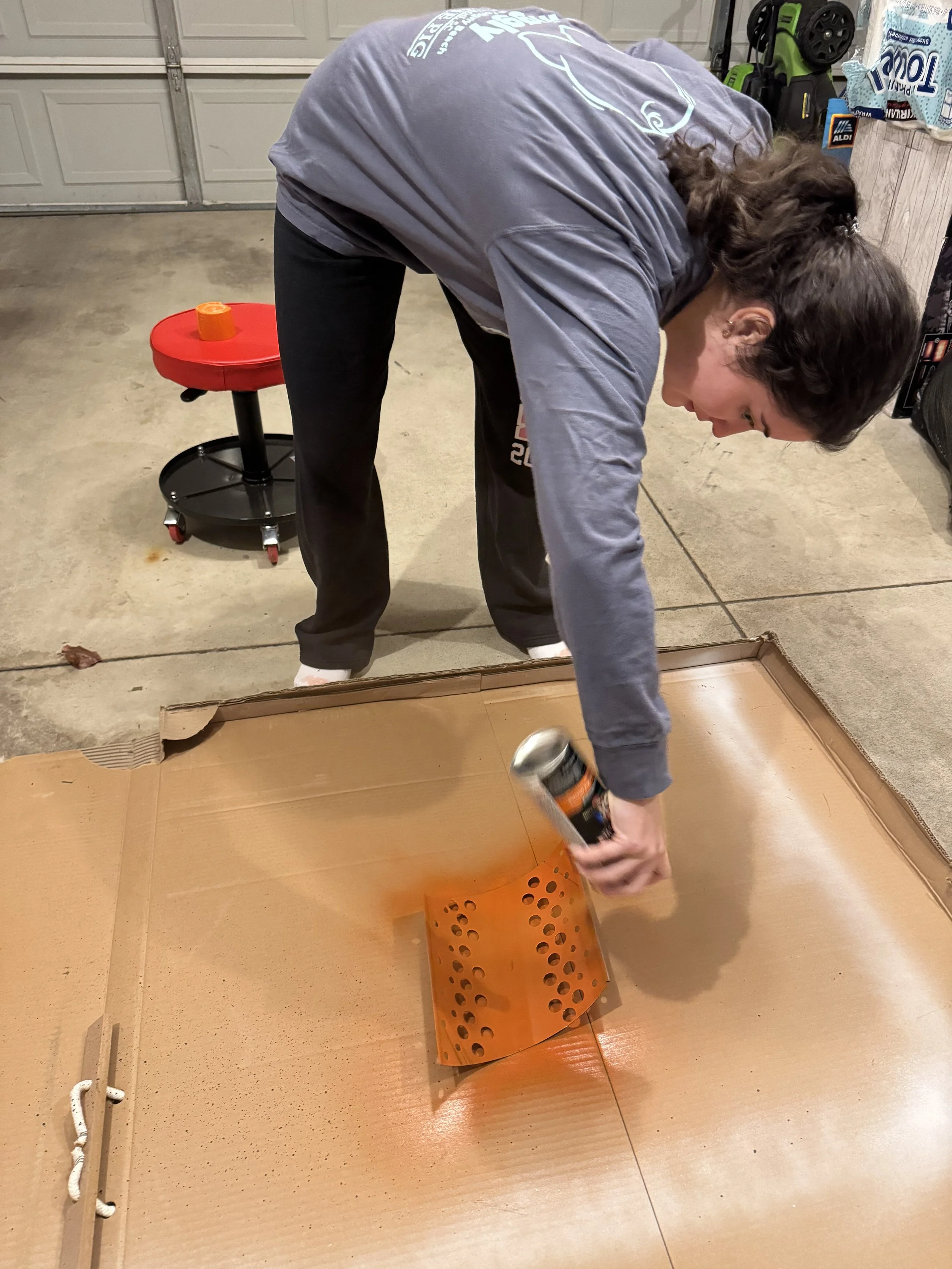
The graphic was printed on vinyl adhesive, then places on a rolled sheet of metal. Each was connected by another rolled sheet of metal that was perforated, spray painted and Cricut cut lettering.
Material Process
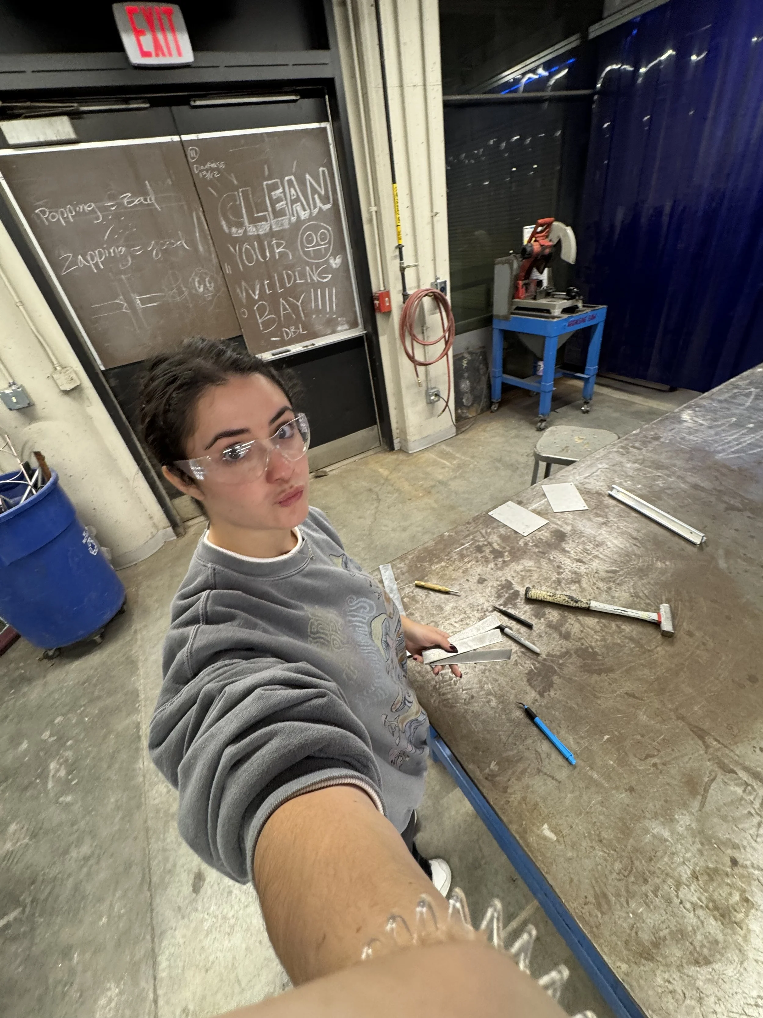
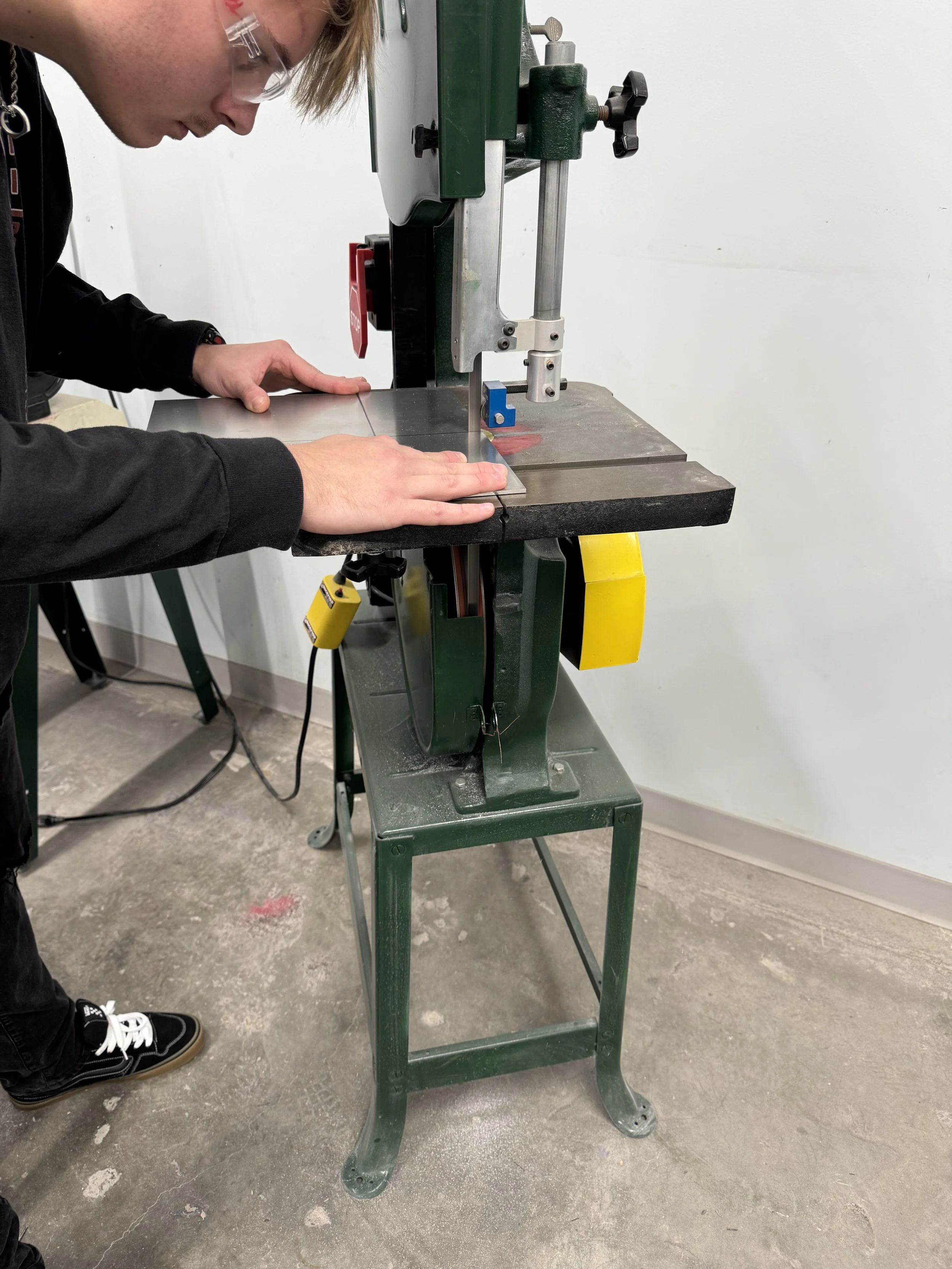
This project had myself learning a wide variety of new techniques. I was in a unique group situation, as we had no industrial design student to collaborate with. I researched for weeks and had many trial and errors through these iterations. But, I learned a lot about materials and physically putting together this prototype.
For this project we were tasked to activate the channel. Because of my intricate helix form, I had to test the best way to make sure it would attach to the pole. The perforated metal was a way to mask the connectors.

Final Product

